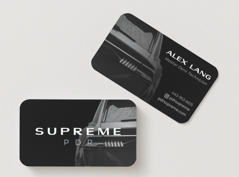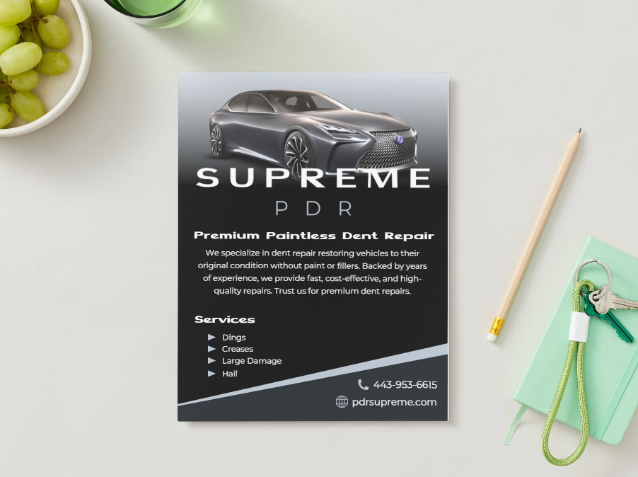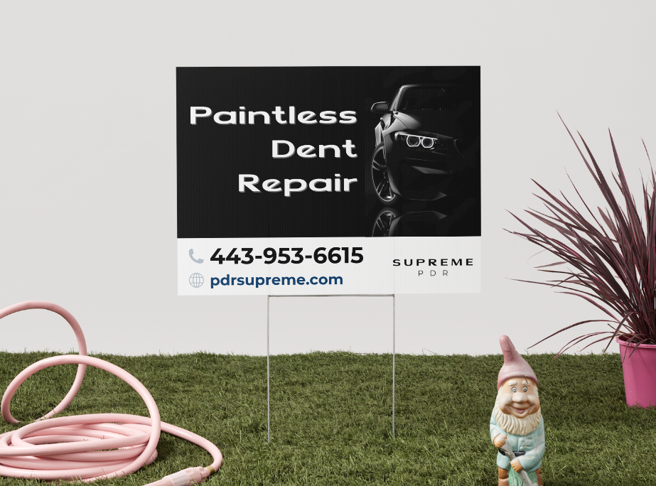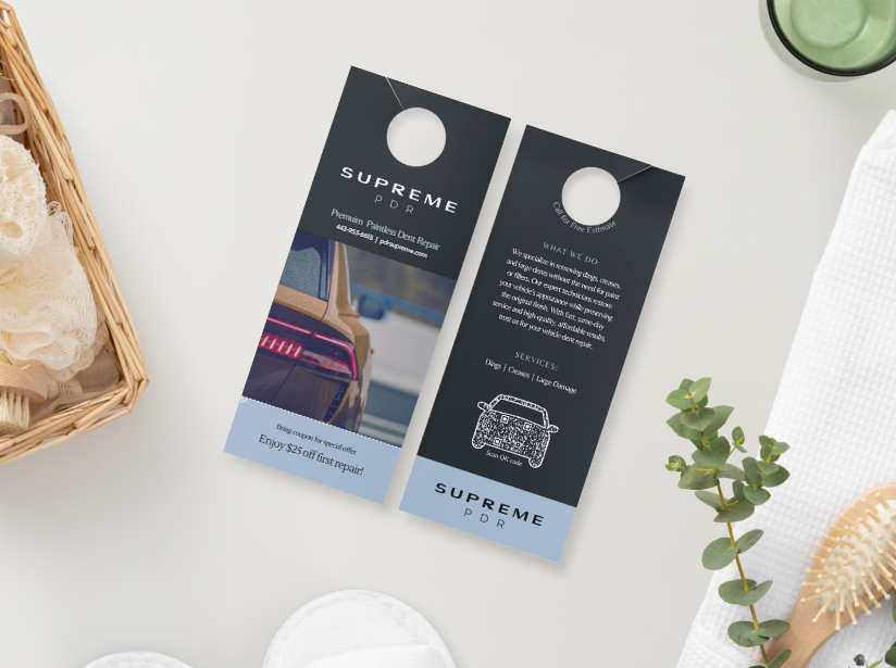

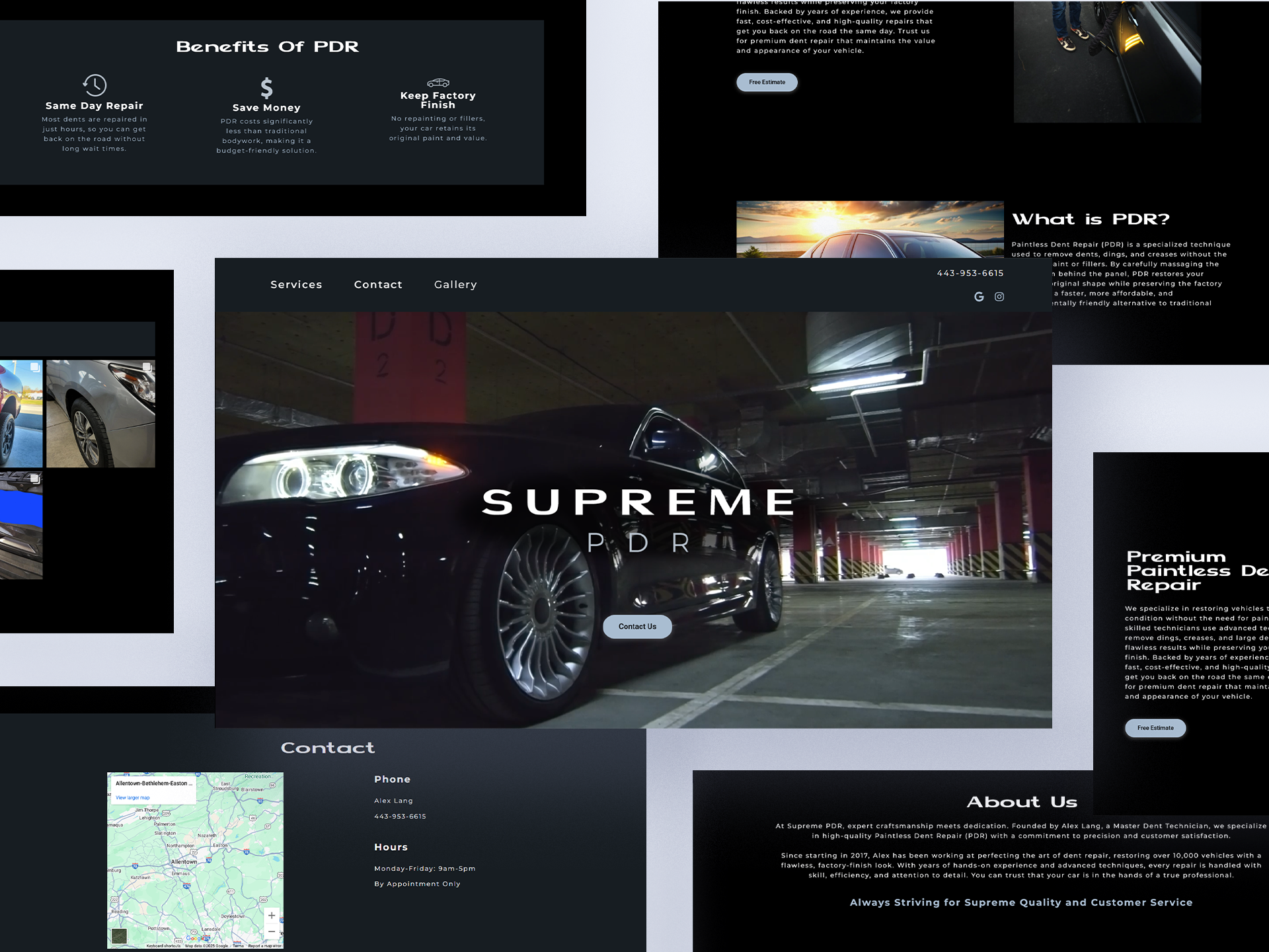
Supreme PDR is a newly established small business in the Lehigh Valley, Pennsylvania area. With competitors in the region, they aim to stand out through strong branding and a professional online presence. I worked closely with the client to develop a cohesive brand identity, designing their website, logo, and style guide to align with their vision. They requested a sleek, modern, single-page design with a dark aesthetic, highlighting their services and showcasing a gallery of completed work.
Supreme PDR
Graphic Designer, Web Designer, Web Developer
 Canva
Canva WordPress
Before designing the website for Supreme PDR, I conducted preliminary research on local competitors in the Lehigh Valley area to better understand the landscape of paintless dent repair (PDR) businesses. This included a competitive audit of their websites to evaluate common content strategies, user experience patterns, and overall presentation of services.
Several recurring issues became evident during the research phase:
1. Lack of Clear Information
Many sites failed to clearly explain what PDR is and how it works. For a service that many potential customers are unfamiliar with, this presents a major usability issue and a missed opportunity to educate and convert visitors.
2. Disorganized or Overloaded Content
On the opposite end of the spectrum, some competitor sites presented too much information in an unstructured format. Dense paragraphs, cluttered layouts, and uncurated photo galleries made navigation difficult and detracted from the user experience.
3. Missing Trust Elements
Customer reviews, certifications, and professional affiliations—key credibility markers—were often missing or poorly presented. This lack of trust-building content can make it harder for users to feel confident in choosing a service provider.
4. Weak Calls-to-Action (CTAs)
Many sites lacked clear, consistent CTAs such as “Get a Quote” or “Book a Repair,” leaving users unsure of what to do next. This gap often led to missed opportunities for conversions.
5. Poor Mobile Optimization
A significant number of competitor websites were not fully mobile-friendly, despite the fact that most users are likely searching for dent repair services from their phones.
The research highlighted a clear need for a more user-centered and informative digital experience. For Supreme PDR, I set out to design a site that:
By addressing these key gaps in competitor websites, the Supreme PDR site provides a more polished, trustworthy, and user-friendly experience that meets both business goals and customer expectations.
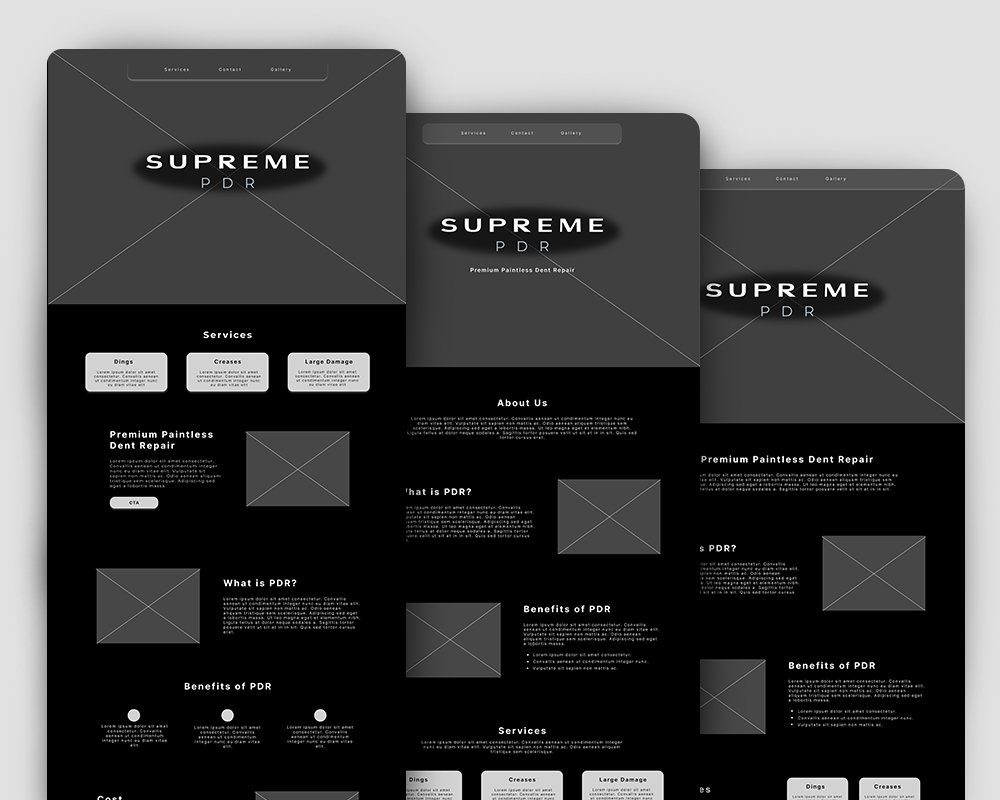
In the initial wireframing phase, I focused on organizing content in a way that would provide a clear and informative flow for users. This involved determining the key sections needed to effectively communicate Supreme PDR’s services, expertise, and completed work. Given the client’s request for a single-page design, I carefully structured the layout to guide visitors smoothly through the most important information—starting with an engaging introduction, followed by a breakdown of services, a showcase of completed work, and an easy-to-access contact section. My goal was to create a seamless user experience that balances aesthetics with functionality while ensuring potential customers can quickly find the information they need.
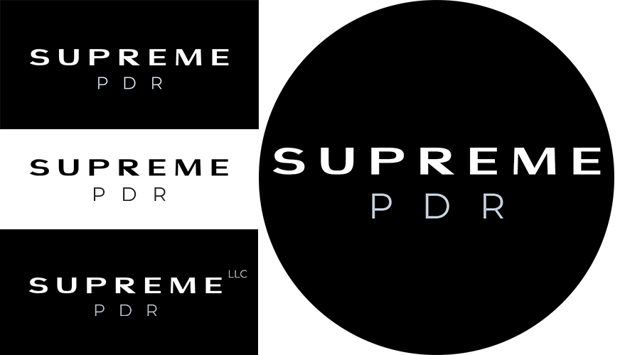
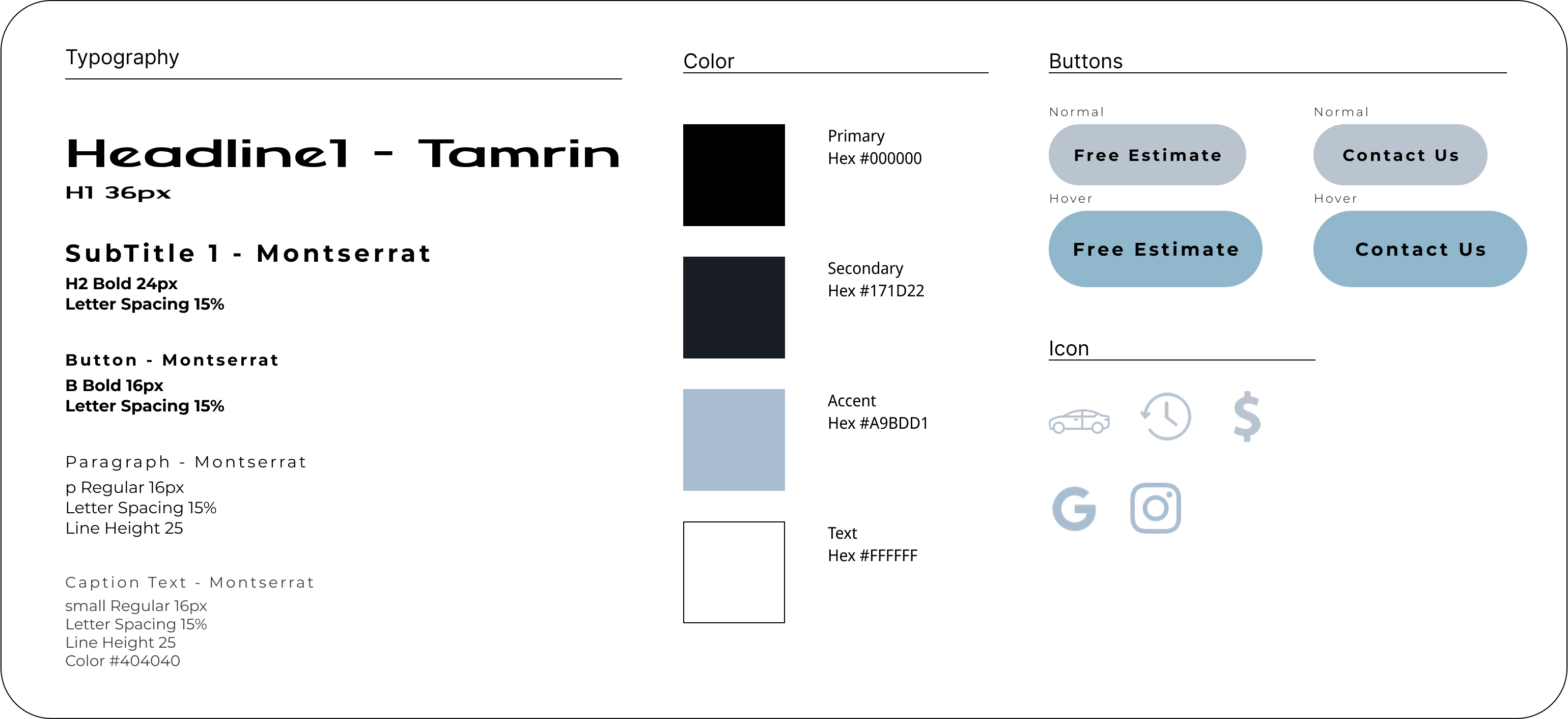
Worked closely with the client to design a clean contemporary logo. Tamrin font was chosen for the logo and main headings of the site. It has a minilaistic design with balanced proportions to esure high readability and versitile in differing forms of branding.
Dark color scheme was chosen with colors based off the range of hues found in fog. Giving layers of depth to the black background.
Web development was created in WordPress. Client requested a video to play in the intro. Pulling the user's gaze to the center where the logo fades into view on load. Web design has a dark color scheme with high contrast images. All top navigation scrolls to differing sections on the sigle page layout.
Client requested a way to show off all images from their Instagram account. To accomplish this a plugin was added that links to their Instragram and display all uploaded photos. This became the Gallery section on their site. The plugin updates as more photos are uploaded to Instagram account so the web gallery stays up to date.

To go along with the new website the client requested digital and print advertistements to attract interest, engagement, and sales for the new business. Created in the software Canva.
