☰
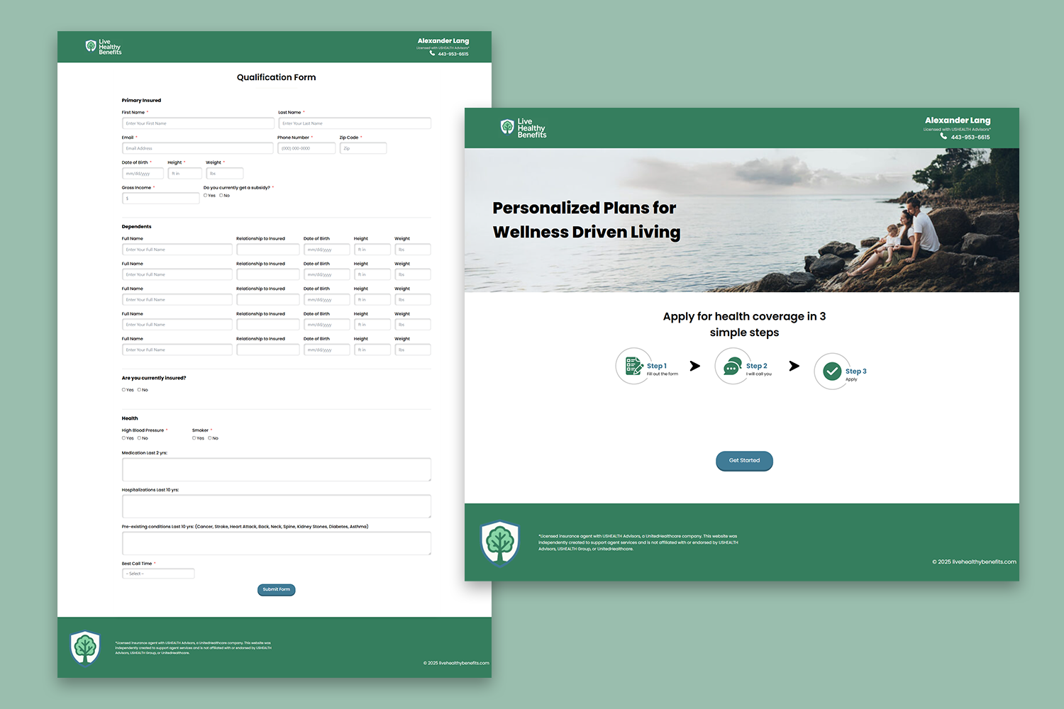
I partnered with an independent insurance agent to create a professional and user-friendly website focused on client conversion. I designed the landing page and developed a streamlined qualification form to help potential clients easily begin the health insurance process. In addition to the website, I contributed to naming the company and crafted its full brand identity — including the logo design, color palette, and overall visual style — to establish a trustworthy and approachable online presence.
Live Healthy Benefits
Digital Designer, UX/UI Designer, Developer
 Adobe Photoshop
 Figma
FigmaWhile the client provided specific requirements for the content and structure, I referenced the layout and language style of the licensing company’s site to ensure consistency with industry standards and to maintain credibility.
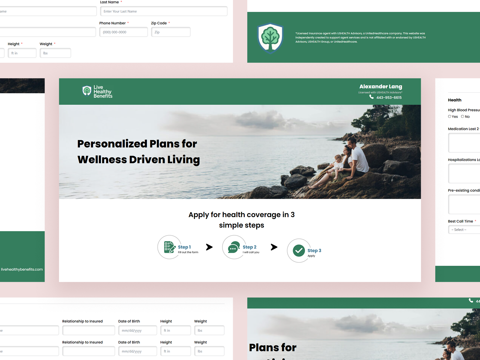
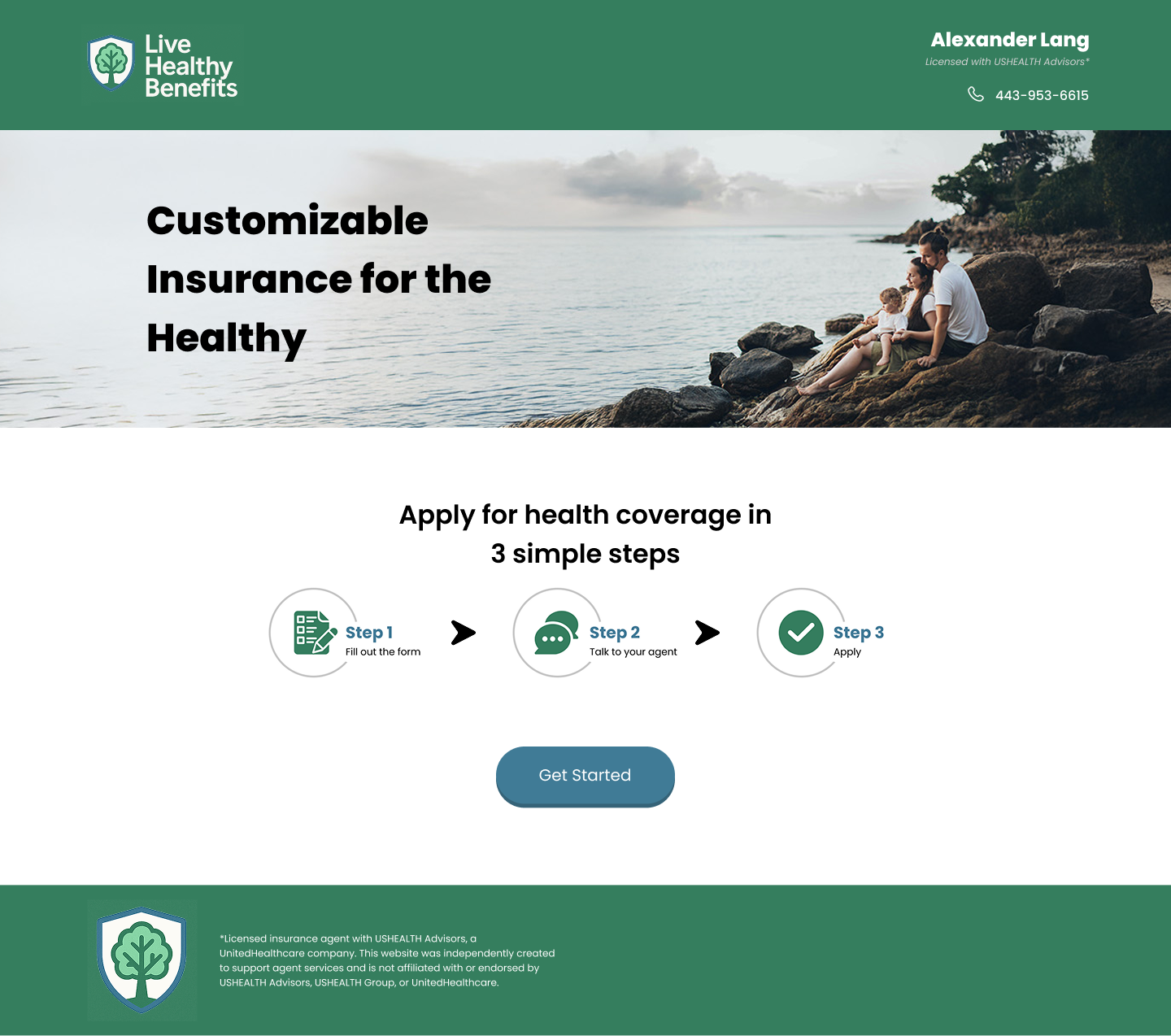
My goal for this project was to create a clean, approachable interface that makes it easy for potential clients to understand and begin the health insurance qualification process. I focused on clarity and simplicity, designing a streamlined page layout with a calming, welcoming hero image and clear step-by-step guidance. To enhance usability, I thoughtfully reorganized the qualification form to improve flow and accessibility, ensuring that users could navigate the process with ease and confidence.
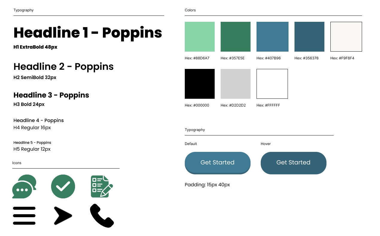
The visual identity was designed to communicate trust, health, and protection — key values in the insurance space. I chose a green color palette to symbolize wellness, growth, and reassurance. The logo features a tree enclosed within a shield, combining two meaningful symbols: the tree represents life, stability, and renewal, while the shield emphasizes safety and security. This pairing reflects the client’s commitment to guiding and protecting their clients through the health insurance process.
For typography, I selected Poppins, a modern, geometric sans-serif font. Its clean lines and balanced proportions complement the overall design by enhancing readability and giving the site a friendly yet professional tone. The font's approachable style pairs well with the visual branding to create a cohesive, trustworthy user experience.
The website features a clean, welcoming layout that guides users through the qualification process with ease. I placed a strong emphasis on accessibility and clarity, particularly when structuring the qualification form. Each section was thoughtfully arranged to improve flow and reduce friction during completion.
To set an emotional tone of trust and calm, I selected a hero image showing a family looking out over the water at a beach. This imagery evokes a sense of peace, stability, and hope — aligning with the client’s goal of offering supportive, reliable insurance services.
The client was pleased with the overall design and branding, which now provides a strong foundation for building client trust and growing the business. The simplified user journey encourages engagement, while the optimized form structure improves usability.
In the future, the client has potential interest in expanding the site by adding a calendar page after form submission, allowing users to seamlessly schedule consultations and further enhancing the onboarding experience.